Osirium Icons
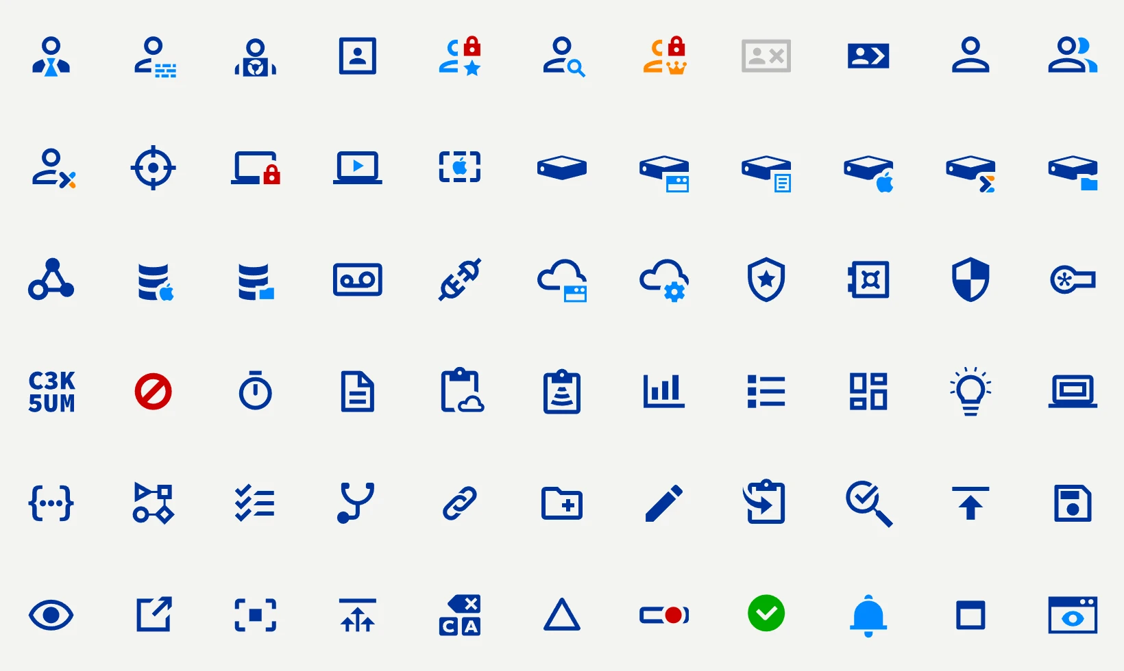
When I joined Osirium, the product icons were a folder of 154 low-resolution bitmaps gathered over the years. Glossy, flat and clip-art styles sat side by side, on eleven different canvas sizes, with white backgrounds instead of transparency. Colours ranged from traffic-light red and green to purple. They were grainy at every size, and 'break glass', emergency access that bypasses the usual approvals, was shown as a PDF icon.
Privileged access was also completely new to me. To learn it, I made a habit of drawing an icon for every new concept I met. Material Design had nothing for this world of vaults, credentials, timed sessions and protected servers, so the habit grew into over 300 icons. Designed on Material's 24px grid and following its rules, they sit naturally beside the standard set.
The subset that went into the products was debated with the engineering and documentation teams. We settled most in person, in bulk review meetings, and I answered the rest through Jira tickets. From there the set became Osirium's one visual language: in the product interfaces, on the website, in datasheets and reports, and in diagrams and video.
Everything came from one Illustrator master. SVGO-optimised SVGs and a sprite, PNGs at 1x, 2x and 3x, and an IcoMoon font replaced the old bitmaps and let updates ship fast.