Anatolia
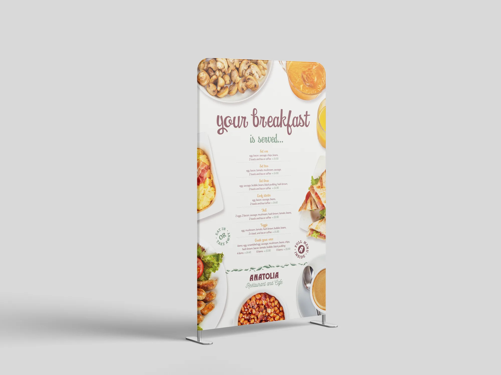
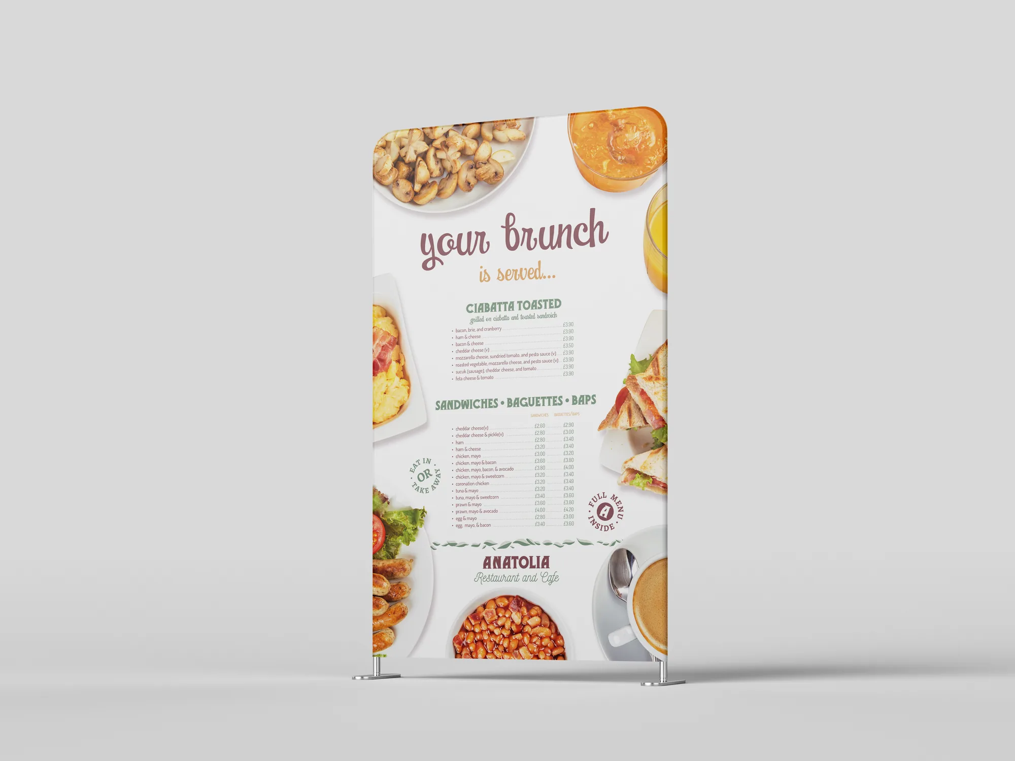
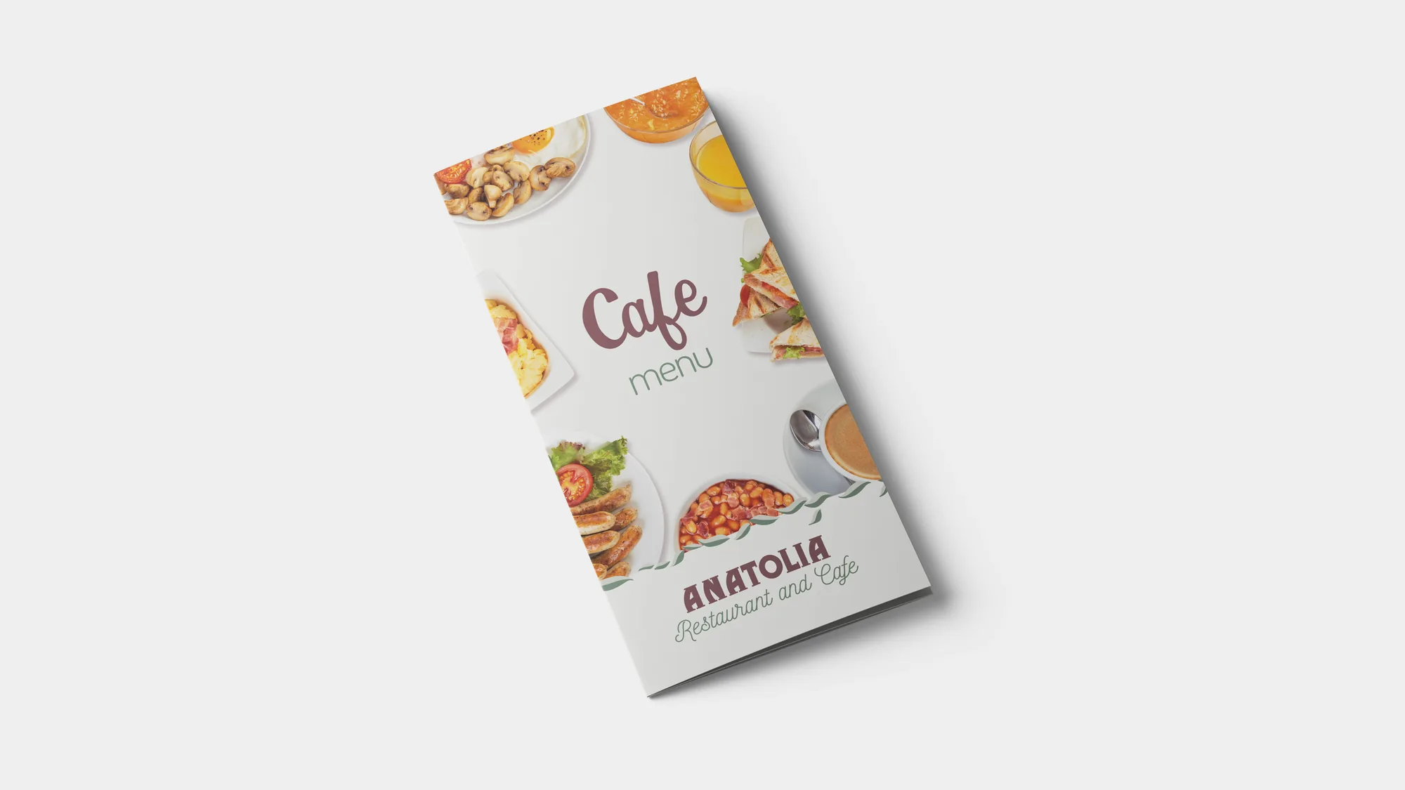
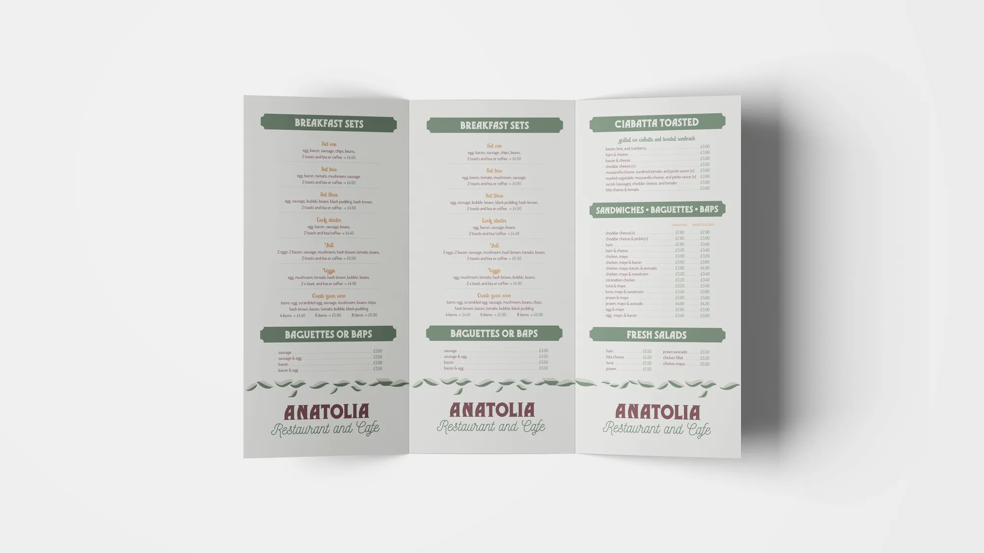
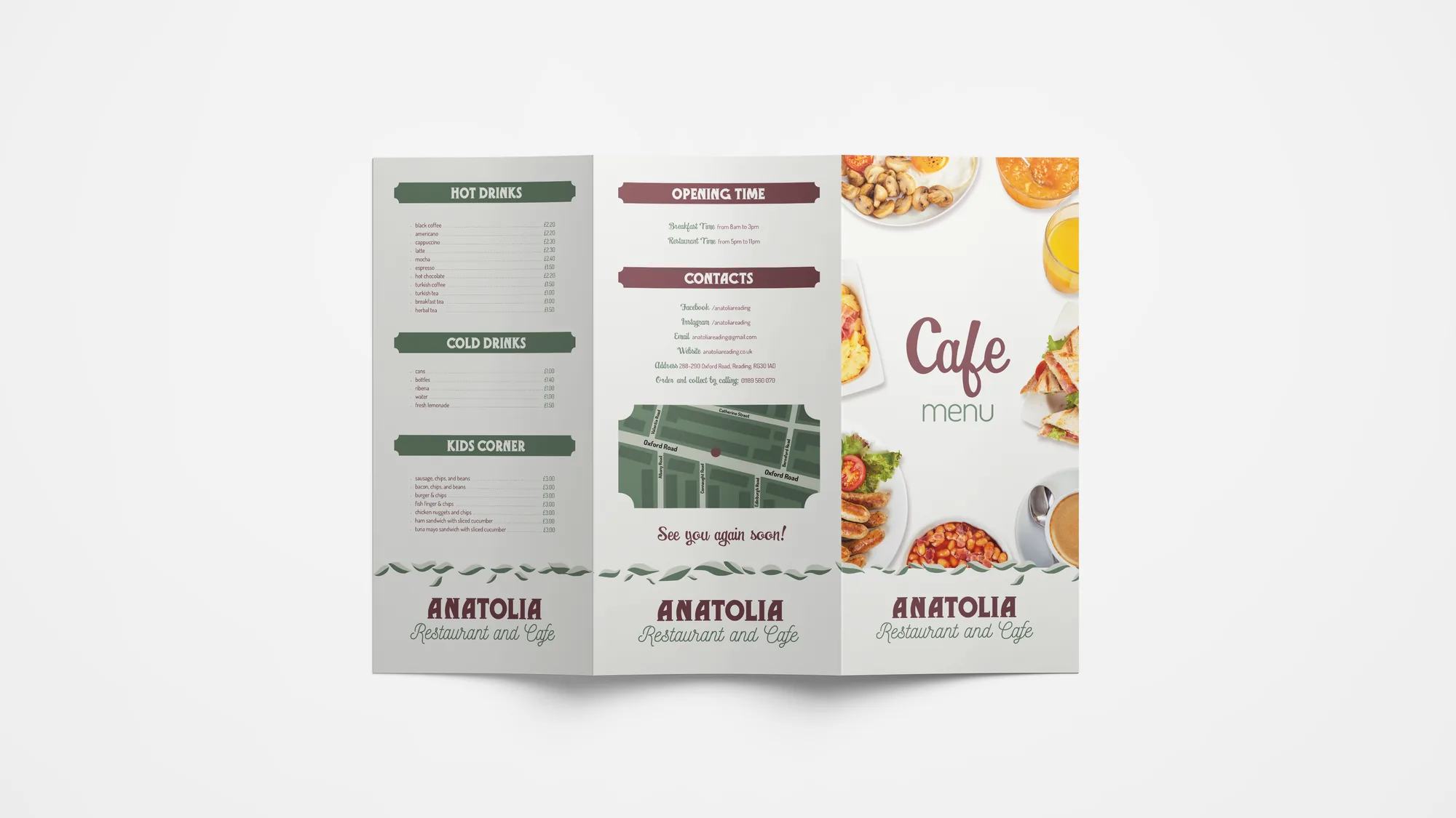
Branding and marketing materials designed at Minuteman Press for Anatolia Restaurant and Cafe. The restaurant had no brand of its own, so every visual choice was mine.
To find inspiration, I visited the restaurant. Its most distinctive feature was a large, wide trompe-l'œil mural depicting a musician. I vectorised the leaves painted in it and turned them into a running horizontal band of foliage, a graphic element that ties the brand to the place. I also chose the typefaces for the logo and the text.
The identity was then applied to a tri-fold menu, where a clear grid keeps a long list of dishes easy to scan, and to a double-sided pavement sign promoting breakfast and brunch.
Style and typefaces: The identity has a warm, retro, homely feel, with muted plum, sage green and orange on an off-white ground, framed by real food photography. Gramophone NF is reserved for the logotype. All menu text is set in a single family, Dosis, with its weights creating the hierarchy, while two vintage scripts add warmth: Swingdancer for the headlines and Nickainley for secondary accents.