Design Genius
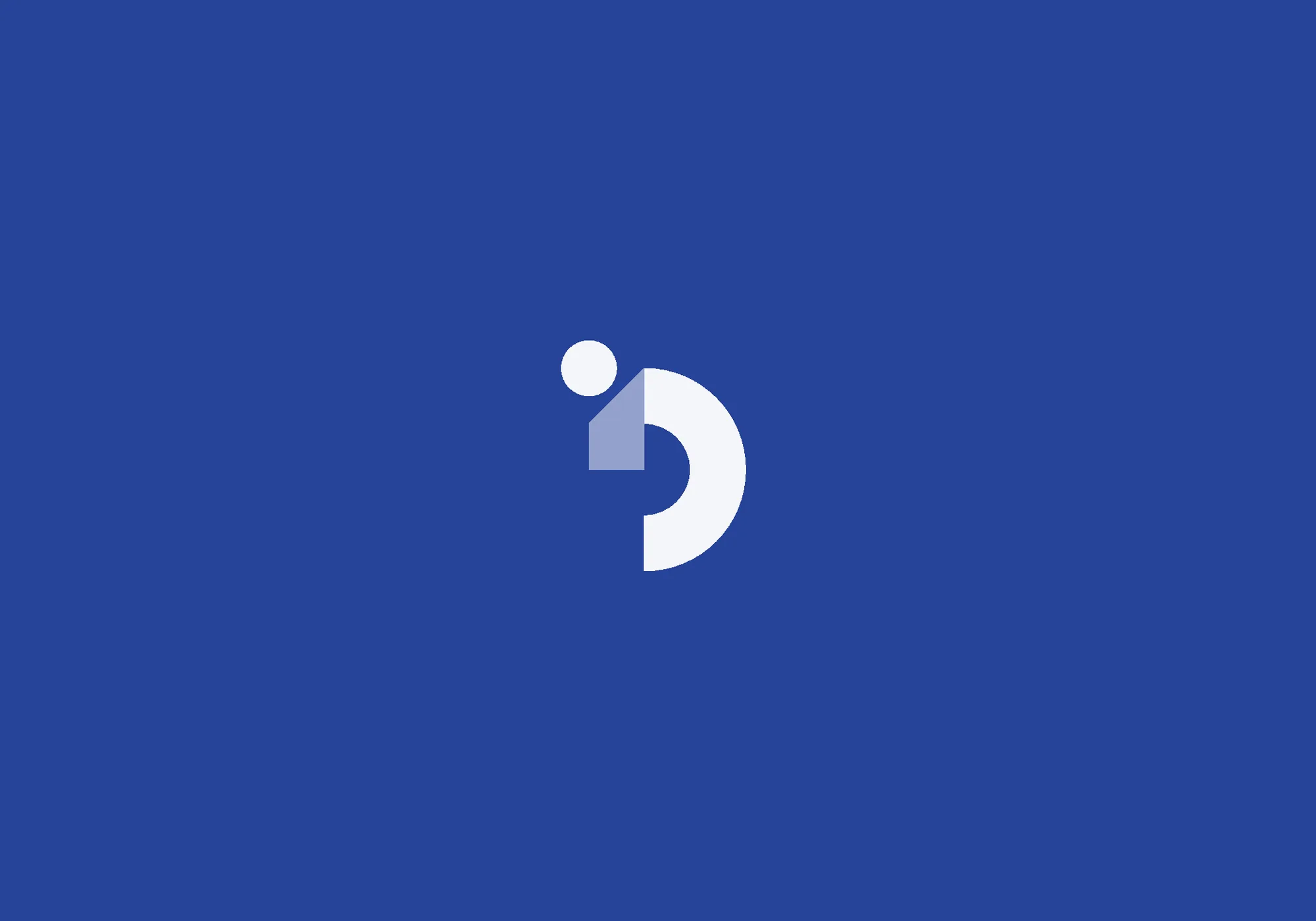
A personal project: the logo for a design agency I would like to set up one day.
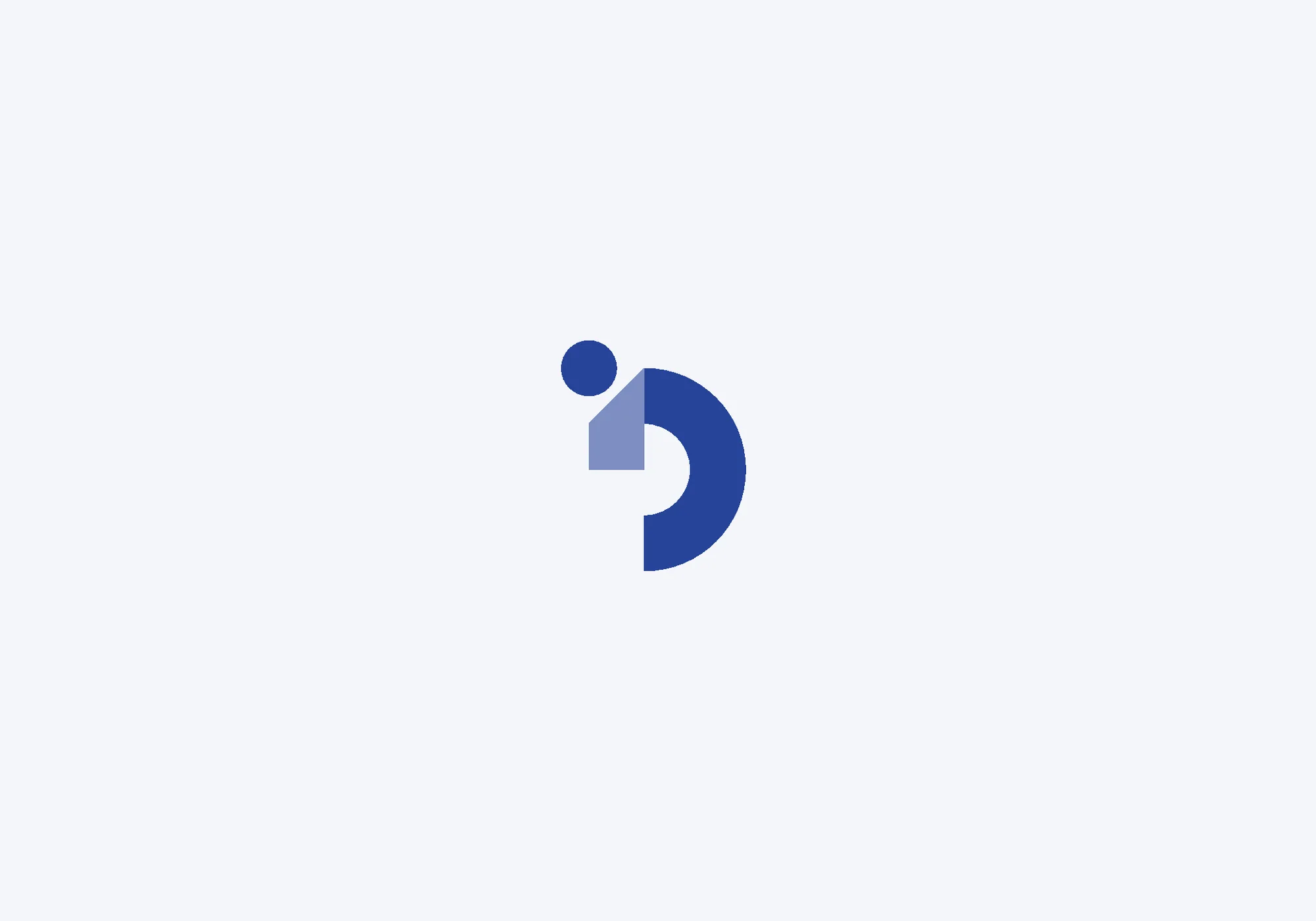
The mark combines the two initials, D and G. The shapes are rotated and arranged so that, with the addition of a full stop, they form a small figure, the 'genius', leaping forward: the full stop is the head and the D is the body in motion. The arm is set in a lighter blue, as if folded back to complete the G, which also gives the flat mark a subtle sense of depth. Guided by the ARMM model (attention, response, meaning, memory), the result is a simple, friendly character that is easy to remember.
The mark is built on a geometric construction grid. Its two blues carry into the wordmark, with 'Design' in the darker blue and 'Genius' in the lighter one, and it works in positive and reversed versions.